
The Scrum Burndown Chart: A Primer
Just like any software development project, Agile still has to produce and use metrics that can show the progress and efficiency of the team. Since the team is self-managed and the Scrum master’s role is to remove impediments to the team’s work, it may be hard to determine the standards when the parameters of the project changes every sprint.
Still, the Scrum Burndown chart gives the project manager, organization and product owner powerful insight into how the team functions within the Agile context.
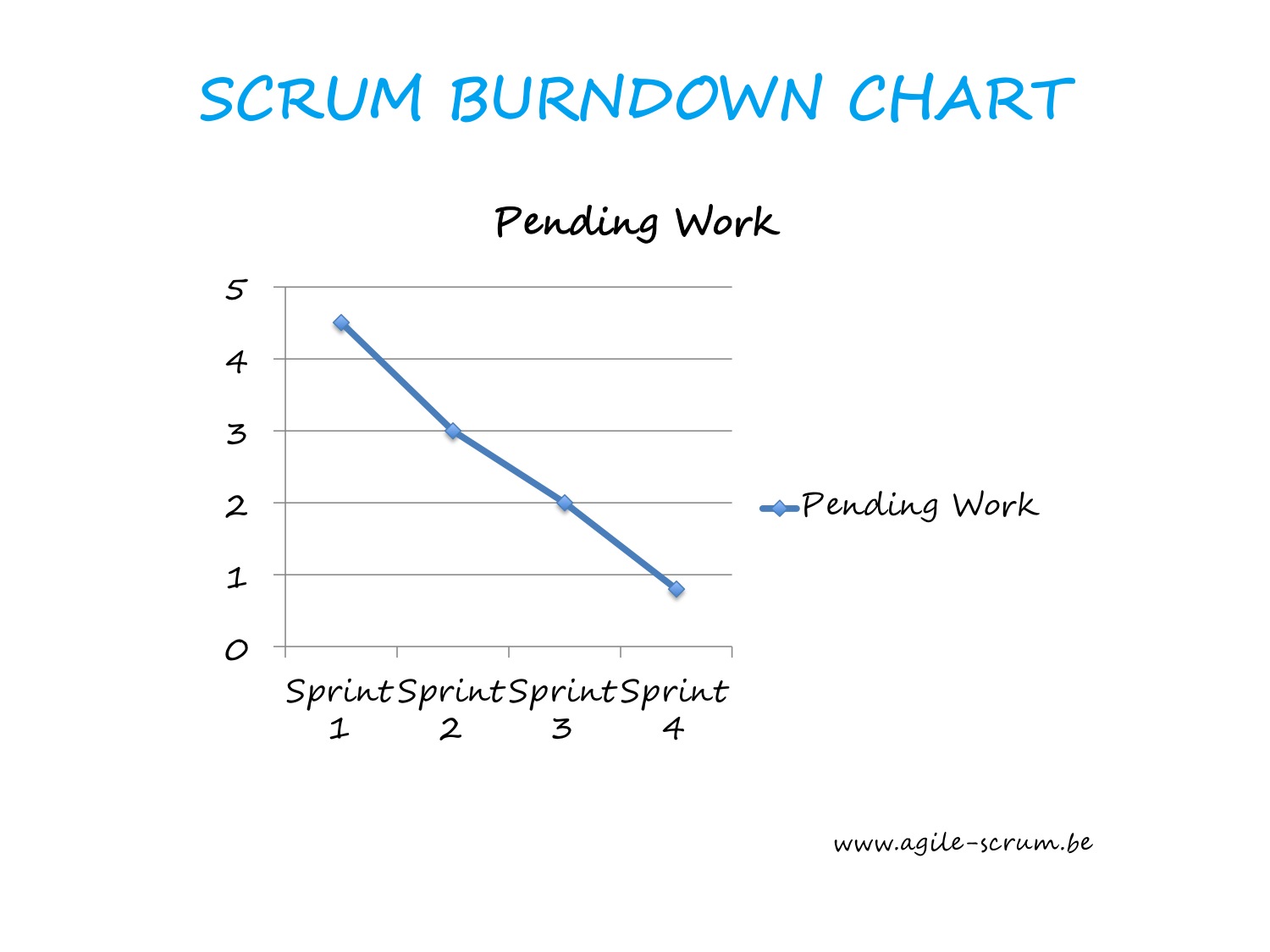
Teams use the sprint Burndown chart to track the product development effort remaining in a sprint.
Generally speaking, the Burndown chart should consist of:
- X axis to display working days
- Y axis to display remaining effort
- Ideal effort as a guideline
- Real progress of effort.
The Y-axis has variable representations depending on the preference of the company or organization. Each use of the Y-axis has its drawbacks and advantages:
- Number of stories. When you determine the items by the number of stories left, you basically say that each story has the same amount of effort involved. When you’re working with an epic story broken down into smaller stories, you’re going to be in trouble.
- Time. This approach works best for beginner agile teams that aren’t familiar with this type of project management. The problem with a Scrum Burndown chart that uses time is that this leads to micromanagement and still adheres too much to a waterfall methodology with a taped-on Scrum label.
- Remaining size. While this model uses stories, it instead uses points instead of the actual stories to measure the backlog. This way, some stories may be completed while others are in progress.
Some experts would argue that one line isn’t enough to create a good metric for Scrum. You might want to add the total backlog as a separate line to show how the story completion is going for the moment. This way, the stagnant line can show that you’ve actually made progress as shown in comparison to the overall story backlog.
Another suggested feature could be impediment points. Scrum Masters can use this to show where obstacles cropped up and at which point these were resolved. This is one of the best ways to show how responsive and ‘agile’ the team actually is.
So how do you interpret a Scrum Burndown chart? No matter what Y-axis or chart elements you add, there are still some easy ways to spot a good team from a bad team. Here’s how:
- The best team always finishes all the stories on time. Take note that they don’t finish early or late. While Agile likes to say that their project finish earlier, you may come up with a raw, unpolished application or something that lacks complex functions. Sometimes, the early finish is also an indication of bad estimation and forecasting on the part of the project manager.
- A great team has slow progress in the beginning but manages to finish everything towards the end of the sprint. While time management and cramming is clear at the end, the lessons learned in this sprint can make them the ideal team in the next.
- A nice, functioning team shows typical progress and finishes the commitments on time. However, the stories get moved around too much and re-prioritized too often during the sprint. Still this is the most typical chart you can see from most agile teams.
- A late sprint team means that there might be a snowball effect for the succeeding sprints. This means that some stories and commitments weren’t finished despite the planning and discussion at the end of the previous sprint.
- There are so many reasons a sprint can go bad. The impediments may be too much for the Scrum Master, there is insufficient reporting and communication with the project manager or there simply isn’t any work getting done.
The Sprint Burndown chart is another metric that needs to be planned and discussed. You can even include it as a User Story for reporting and metric purposes before the first sprint. In the end, the more experienced teams can use the chart better and understanding it isn’t as easy as you think.
